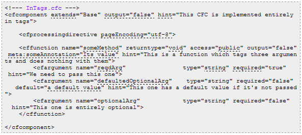
As mentioned a coupla days ago ("Attempting a new approach to annotating code"), I've decided my approach to annotating my code examples - by colour-highlighting the lines of code I want to discuss, and then cross-referencing that back into the notes - doesn't work so well when there's lots of stuff to discuss. So I decided to come up with a different approach.
Here's an example of what I mean:
Despite that only having some changes in background colour, it's actually very hard to read. The odd bit of highlighting is fine, but not if it's most of the code. So I decided to take a more subtle approach.
Here's that same code now ("A quick primer: porting CFCs from tag-based to script-based"):
When one hovers over one of the annotations, one gets the explanation in a tool tip, as well as the relevant annotation in the body of the article also being highlighted:
Much clearer.
It was surprisingly little JQuery code to effect this. Firstly I mark-up the code & annotations:
<span class="xr xrt xrSelected" data-index="1">extends</span>
<li class="xr xrd xrSelected" data-index="1"><code>extends</code> (and other attributes of the <code><cfcomponent></code> tag) are expressed in exactly the same way as before.</li>
xris a cross reference- and a cross reference has a term (
xrt) and definition (xrd). These are borrowed from how a<dl>works. - each
xrhas adata-indexattribute too.
// blogBottom.js

// code annotations
$(document).ready(function(){
    $(".xr").each(function(){
        var el = $(this);
        var index = el.attr("data-index");
        el.on("mouseover", function(){
            $(".xr").removeClass("xrSelected");
            $(".xr[data-index=" + index + "]").addClass("xrSelected");
        });
    });

    $(document).tooltip({
        items    : ".xr.xrt",
        track    : true,
        content    : function(){
            var el = $(this);
            var index = el.attr("data-index");
            var xrd = $(".xr.xrd[data-index=" + index + "]");
            var text = xrd.text();
            return text;
        },
        position    : {
            my: "right top+50",
            at: "center top",
            using    : function(position,feedback){
                $( this ).css( position );
                $("<span>")
                    .addClass(feedback.vertical)
                    .addClass(feedback.horizontal)
                    .addClass(".xrTooltip")
                    .appendTo(this);
            }
        }
    });
});
- I add a
mouseoverhandler to eachxr(so that's both all the terms and the definitions too); - which highlights all the
xrclasses with the same index number. This could be a single bit of code and its explanation, or multiple bits of code cross-referencing to the same explanation. - I also add a jQueryUI tool tip to each
xrt(the bit in the code), which also pops up with thexrdtext in it. I've done this because sometimes the explanations are quite a way further down the page from the code being explained, so it's handy to have the explanation right there. - Note I didn't quite get my brain around the options on the
my/atsettings for the positioning of the tool tip, so I just messed with them enough to display kinda where I wanted them too; away from the code, so one could still read it. These settings might not be the most sensible, but... [shrug].
There's a small amount of CSS too (from blog.css):
/* code annotations */
.xr {
    cursor                : help;
}
.xr.xrt, .xr.xrd.underline {
    border-bottom        : dashed 1px black;
}
.xr:hover, .xrSelected {
    background-color    : yellow;
}

.ui-tooltip {
    background    : #ffffca;
    padding        : 5px;
    font-size    : small;
}
This is all fairly self-evident.
I've encountered a coupla pitfalls with this approach:
- It doesn't work on the mobile view of the blog for two reasons:
- obviously one can't "mouseover" on a touchscreen device;
- BlogSpot doesn't let me control the mobile template anyhow, so I can't apply a touch-friendly version
- It's a bit of a pain in the next to mark-up the cross references manually, and keep the data-index values sync'ed up.
Thoughts / observations / suggested improvements?
--
Adam


